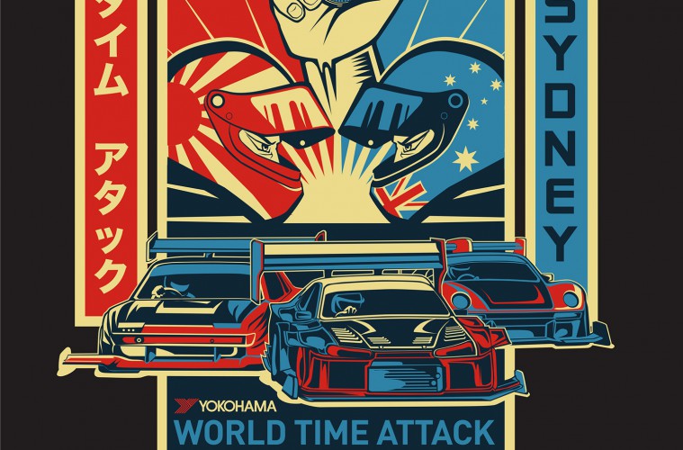
We love this year’s Shepard Fairey inspired World Time Attack Challenge (WTAC) art, so much so that we decided to get in touch with WTAC marketing and promotions guy Greg Lysien to fill us in on the process.
Sharing is caring, and process is king, so we’re chuffed that Greg agreed to send us through some early concepts, right through to completion and application.
For the past six years Greg has kept the WTAC merchandise design separate from all the other promotional and advertising material, partially because it gave him a bit of freedom in terms of design, but also because the merch designs have to be done a fair bit in advance so the guys had to be really careful with what was included in the final designs. In 2011 they had to reprint all merch because one car featured in the design pulled out of the event at the last minute!
This year Greg decided to start really early on the new designs, his brief was to come up with something that is flexible enough to be adopted to all promo and advertising material. WTAC confirmed Scorch S15, MCA and RP968 early on so he banked on those three cars being there.
Other challenges: Between all the online and printed media it’s difficult for designers to come up with a “one size fits all” logo. Some are landscape, others portrait, others square, so Greg wanted to come up with an image that is made up of a couple of different components that can be separated and used as stand-alone images.
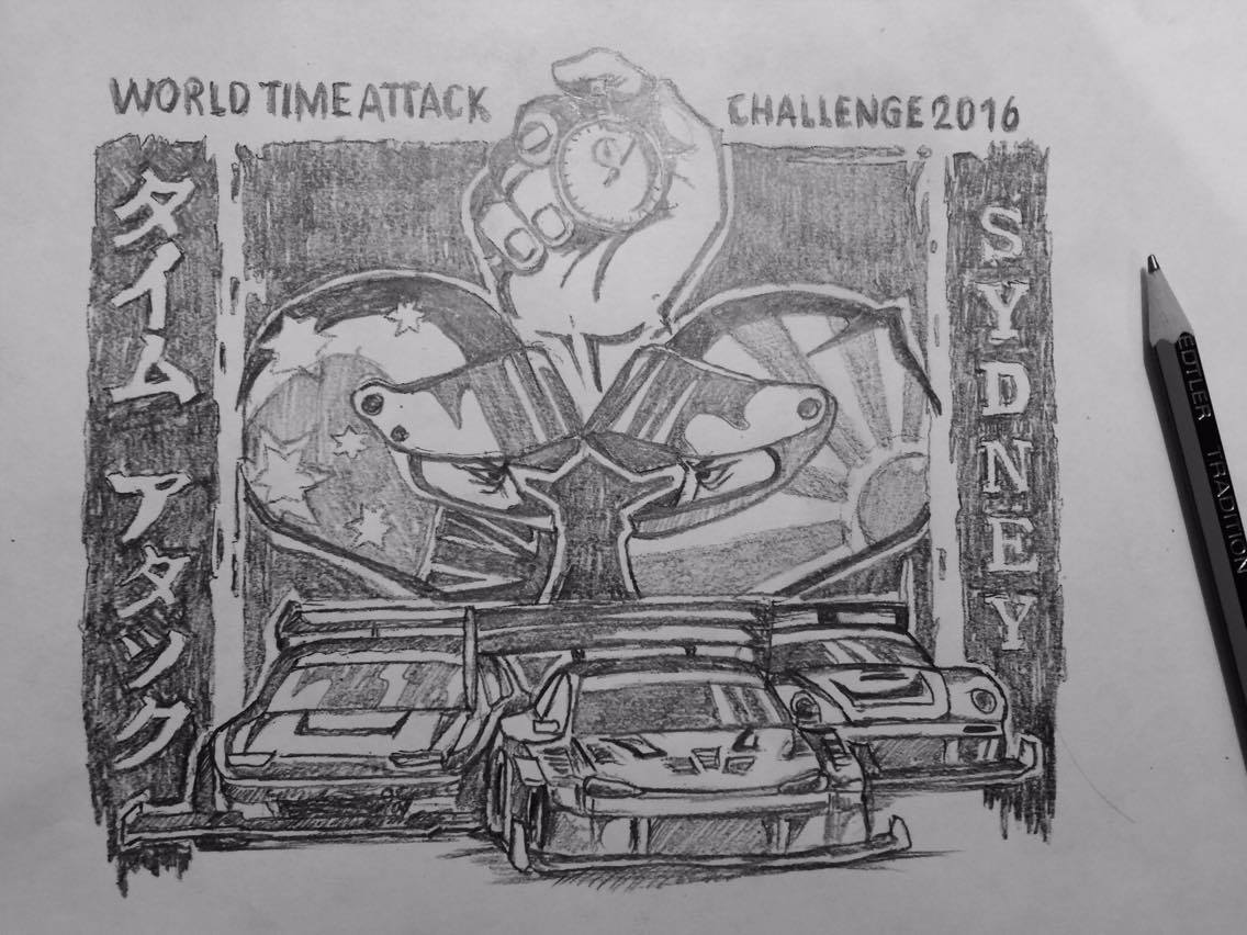
First concept: The main idea was based on a slogan WTAC used back in 2009: Man & Machine vs Time. These were Greg’s key components and each got a symbolic representation in his original scribble.
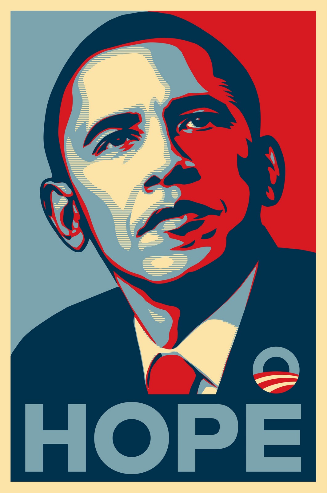
Inspiration: Obama’s “yes we can” poster from 2008 is a big favourite of Greg’s, the simple shapes and the weird yet very effective colouring just works. Greg had to trim down the colours to just three but sticking to a small colour palette actually made him more disciplined and judicious in deciding what details to put in and what to leave out.
![]()
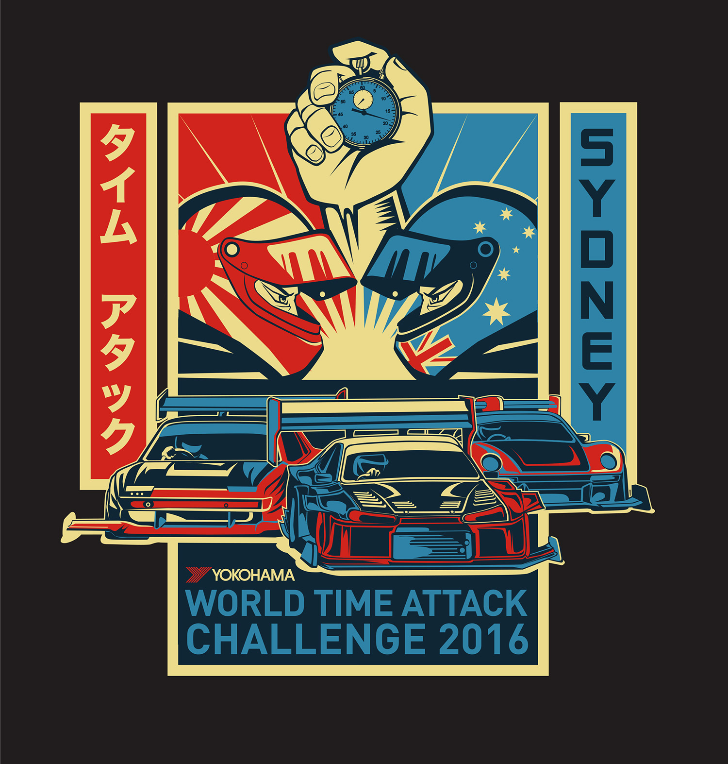
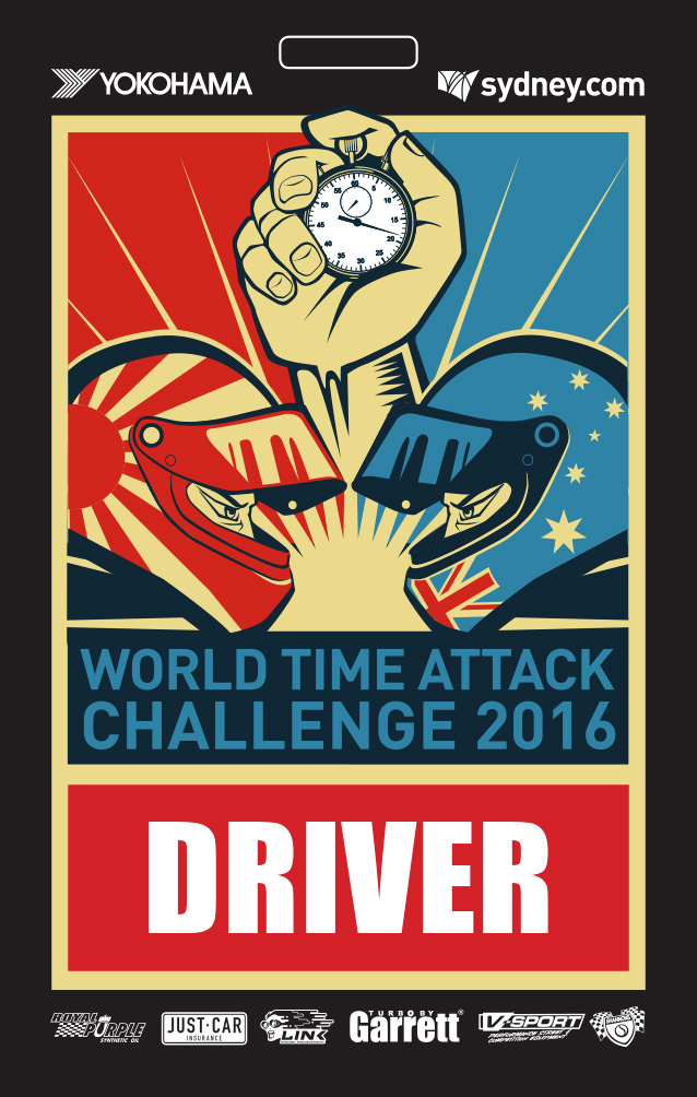
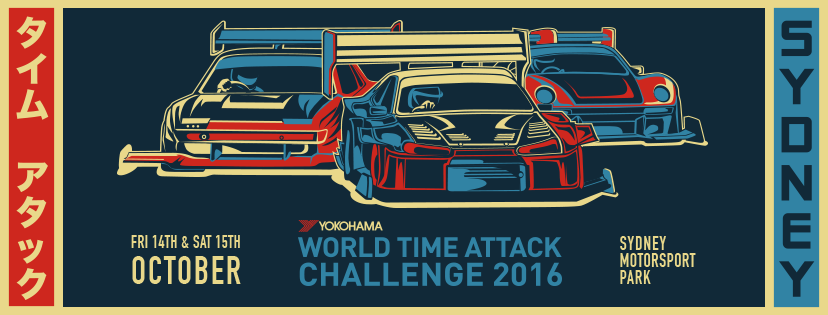
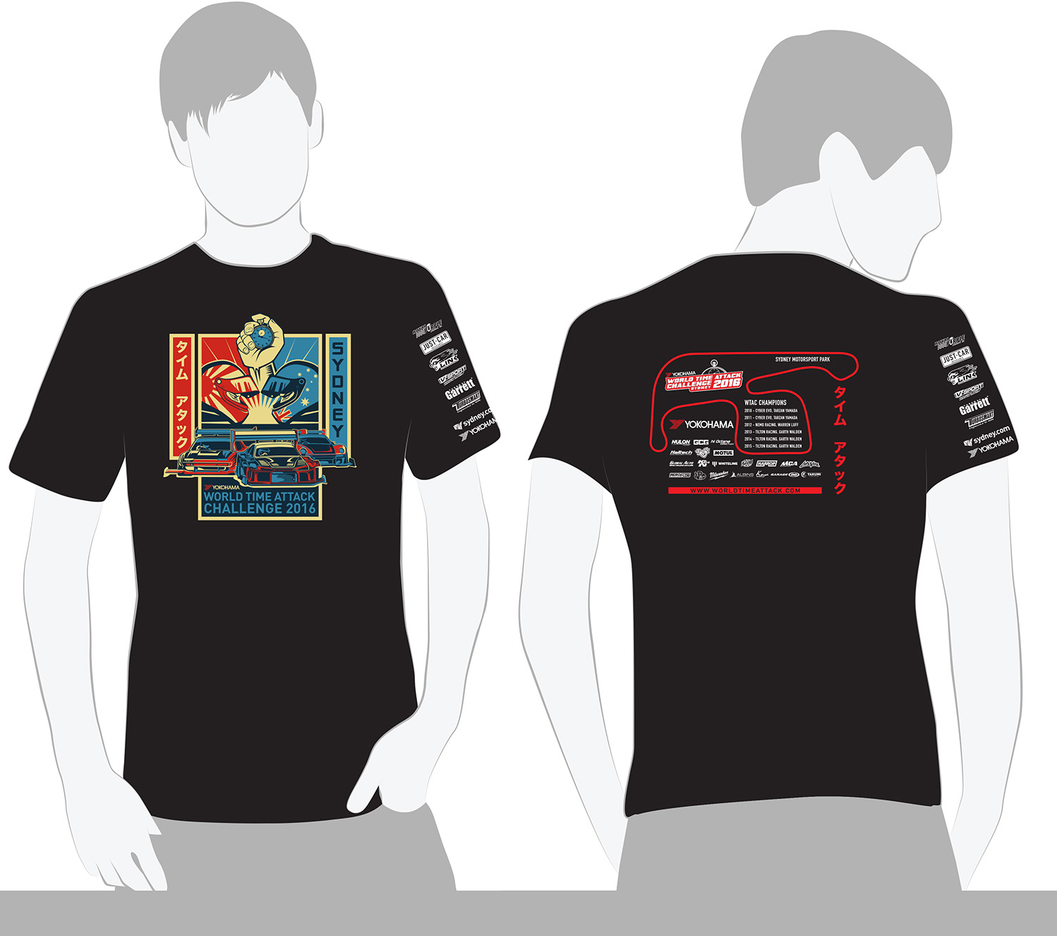
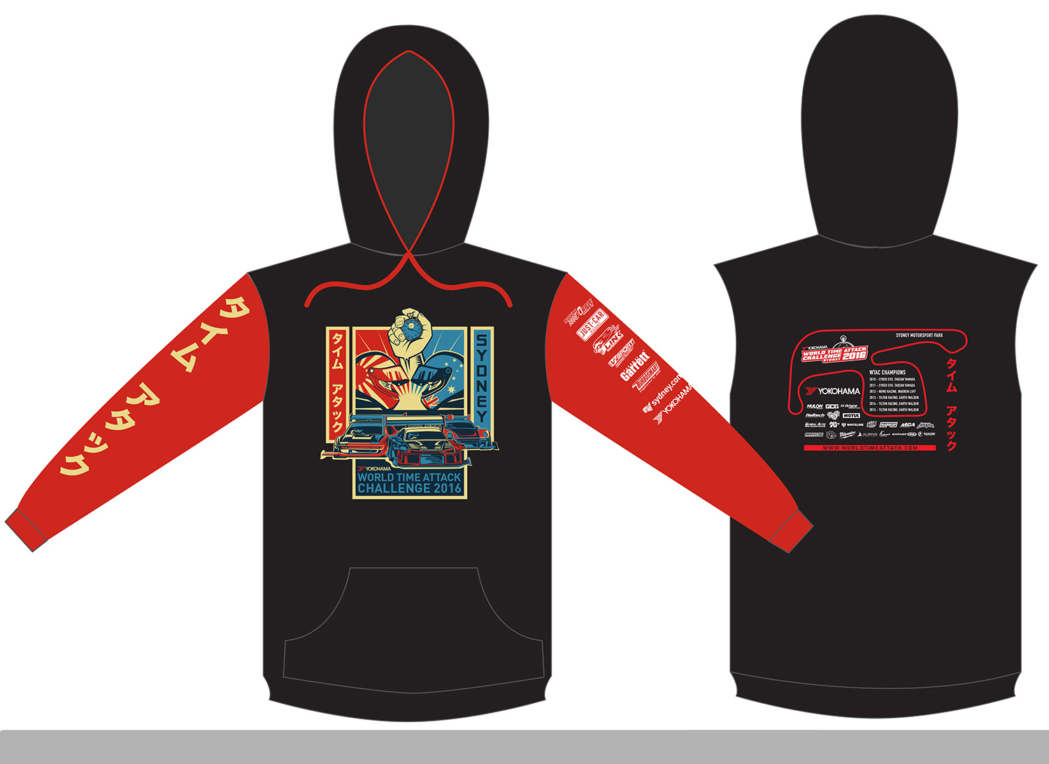
Once he had the main image done and approved, the rest was quite easy. Adapting it to Facebook, posters, t-shirts, stickers and even their accreditation cards was an easy task because of the “modular” design of the graphic.
WTAC hits town on October the 14-15th. Be sure to get your WTAC tickets early. We will be there, with the ZEN Babes and of-course the ZEN Stand! For more info, visit: www.worldtimeattack.com

